European Money Market Institute
Translation of new brand identity to online appearance, development of design principles and systems for public website
Briefing
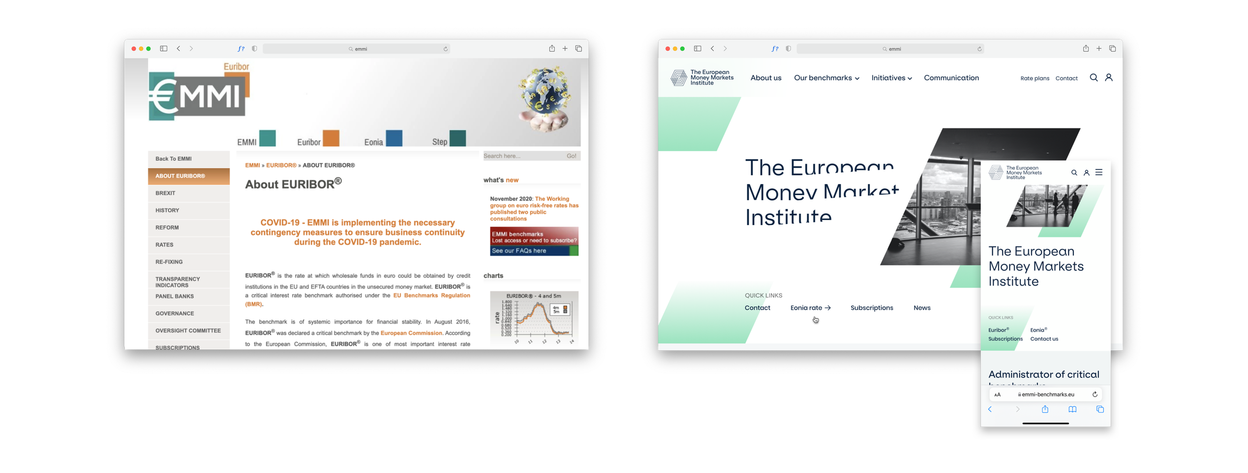
Before the project started a Brussels’ brand agency Hoet&Hoet had helped the European Money Market Institute gone through a rebranding together with a redesign of their visual identity.
It resulted in a fairy limited yet beautifully composed set of assets to start our project with. It was my job to translate the new brand into their online appearance.

Starting point
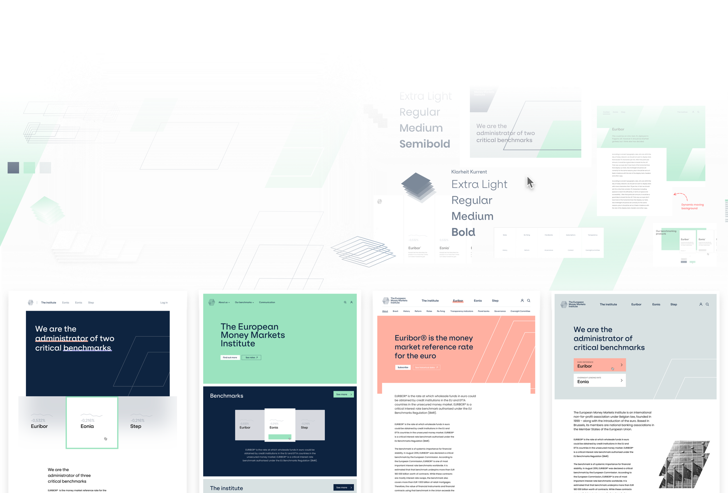
Visual Exploration
Wide explorations, and graphic practises followed with numerous design reviews with the client, the original brand studio and my own team, allowed me to understand the visual identity and its online opportunities.
Challenge
Understand EMMI’s users and build a website that streamlines all processes, ensuring connectivity to future integrations
Together with the team, consisting out of an interaction designer, a strategist and myself, we conducted a series of workshops of which we defined 3 challenges and 3 goals.
3 Challenges
Certain parties republishes EMMI’s free data as if it’s their own
There’s no clear overview of their target group needs
EMMI’s website isn’t coherent not in content nor navigation and structure.
3 Goals
Controlling the data
Reflect integrity and transparency
Position the institute by making people aware of their role through a smooth UX, accessible and inclusive
Design Principles
The iterating design explorations together with the input we gained from the client and their users formed clear patterns.
I started to write down these findings in a constructive and guiding tone. These would form base for everything yet to be designed, but also would give a good consideration of what has been designed already.


Example: Design principle ‘Digestible’

Example: Design principle ‘Educational’
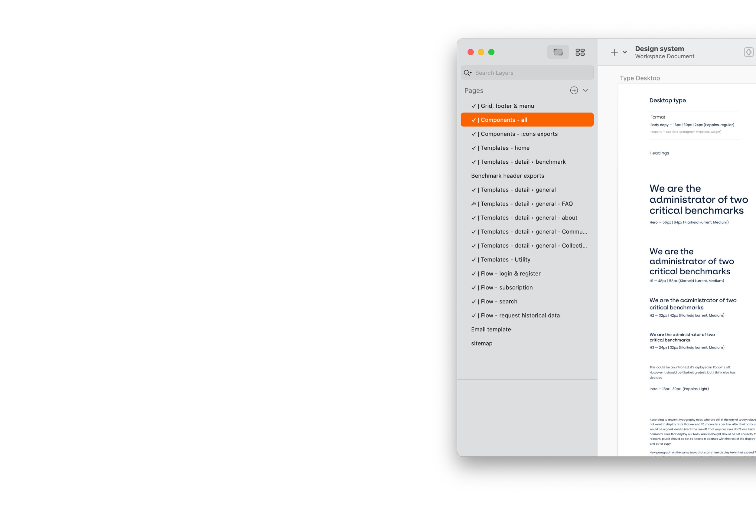
Design System
Even-though it was a short-scoped project, I was convinced that working towards a worthy design system would be beneficial.
This project with its specific ask to focus on becoming futureproof, as well as working together with an offshore content and dev team, asked for a different approach than custom pages.
3 sorts of template-pages where defined.
- Home page (stand alone)
- Detail pages (General and benchmark)
- Utility page
Defining each atom, component and pagetype and the behaviours and states of each, would eventually create a comprehensive common understanding of the design across all teams.
Result
The result was well received by the client.
The website is live today.
