ONYX by STC
Designing a new brand within STC,
creating value for executives
Sketch ∙ Figma ∙ Principle ∙ Keynote ∙ Spline


Context
Within Saudi Telecom Company (STC), my client, DEURS, discovered a need for organisational change.
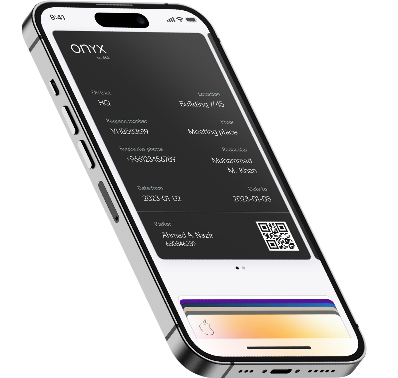
Various programs were started including Onyx, which focuses on C-suite experiences.
We designed a new tier within the organisation, defining new heights of experience, internally as well as externally.
Along with user- and expert interviews, we discovered ways to improve the current experience. Together with the STC's in-house UX members we found pain-points and prioritised opportunities to create impact.
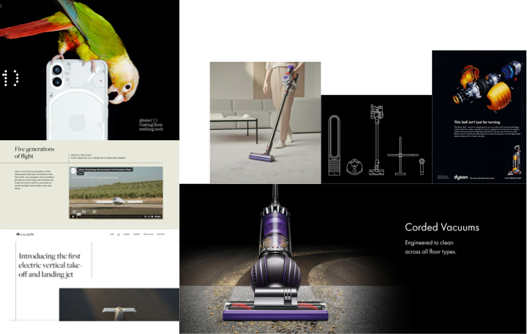


Visual research luxury and high-end brand identities

Based on my research I’ve defined values for Onyx’s visual identity.
They later formed a starting base for Onyx’s service principles


Visual direction concepts
One of the challenges while desiging was keep a visual relation between STC's main brand and Onyx. Where STC’s brand is outspoken, accessible and colourful, Onyx had to communicate a different set of values.
Concept direction A, is cinematic, joyful. The logo is based on sparsely revealing light effects, which at the same time will remind the viewer of a ribbon. A ribbon that communicates, a special occasion, like a gift or a ribbon badge.
B is a lot more toned down, it’s focussing on the serious - business side. But has an elegant touch. It’s an iteration of the revealing light strokes of concept A however it has its focus on a different concept, namely the infinite loop. This loop can be used as logo mark, or can be extracted to a visual style with playful and circular lines. The loop represents the business and iteration process cycle.
C is much more bolt. It communicates with smooth but firm textured gradient symbols. Within the logo there’s a distinction displayed, between human and technology, similar to STC’s business. The distinction is displayed in a combination of sharp- and smooth shapes that cooperate with each other.
Visual direction
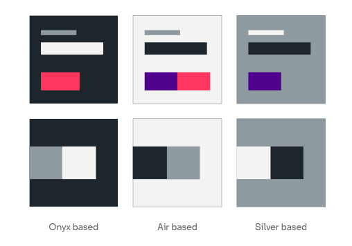
When remaining a link between STC and Onyx as brands, visually, I opted for colour and typeface use.
For example colour: I picked a selection of available colours available from STC’s brand to compose a different use pattern.
A new visual identity would be displayed, however, with a recognisable link to STC’s main brand.

UI Design
A good example of where value can be created for managers is a web application where they track the performance of their teams, via a personal environment. Along with STC’s UX members were able to gather insights in the current state processes to identify pinpoints, and outline the service app, improving current processes, with new flows.
UI
While outlining the web app, I began to think of the online appearance of Onyx. Exploring the user interface, defining components, motion and navigation patterns

Component library
Reviews with STC’s UX team, resulted in a clear direction of UI styling of components and interaction patterns. I’ve collected them all in a library, together with explanations of their behaviour.
Omnichannel
Along with a dedicated service designer we defined more touch-points and thought of concept where value can be created for Executives and managers.